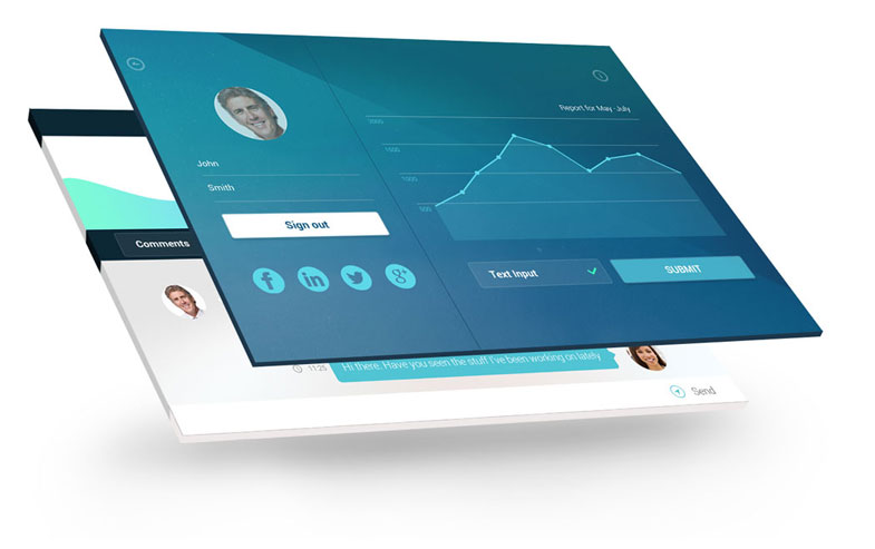
A dashboard is a single page, top-down view that easily shows how related business processes, areas and/or indicators are performing against preset comparable values.
Using dashboards as a quick gauge of performance is not a new concept and many texts covering different aspects of dashboards have been written already.
A Google search for”Executive dashboards” returns over 750,000 results and most of them show endless arrangements of gauges, dials, pie charts, pyramid charts, traffic lights, etc. This probably stems from the fact that most people associate dashboards with these types of objects.
Deciding what should be shown on a dashboard and what message it should convey is the first step when designing a dashboard. A dashboard that does not convey a message is merely a report and could be useful to some users, but won‟t be seen as an integral part of performance management. Showing actual and budget sales next to each other, for example, will show a relationship, but this can then be taken a step further by highlighting variations and alerting the user to areas that require attention.
You can find out more about dashboard design in a free white paper by Stellar’s Chris du Toit.


