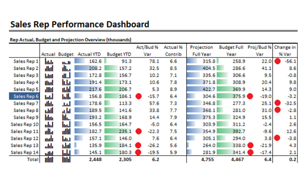
Deciding what should be shown on a dashboard, and what message it should convey, are the first steps when designing an analytics dashboard.
A dashboard that doesn’t convey a message is merely a report. It could be useful to some users, but won’t become an integral part of performance management.
As an example, showing actual and budget sales next to each other may indicate a relationship, but this can then be taken a step further by highlighting variations and alerting the user to areas that require attention.
A message can only be conveyed when values are compared to something else. Displaying January sales as $200K is good, showing that the growth over the prior year is 7% is better and highlighting that the expected growth should be 10% and that the business is not exactly on track is even better.
In most cases, the information needs of users can be satisfied with a small number of visualisation tools, leading to a simpler and more cohesive dashboard design.
» Get the free white paper: Looking past flashy dashboard design


